
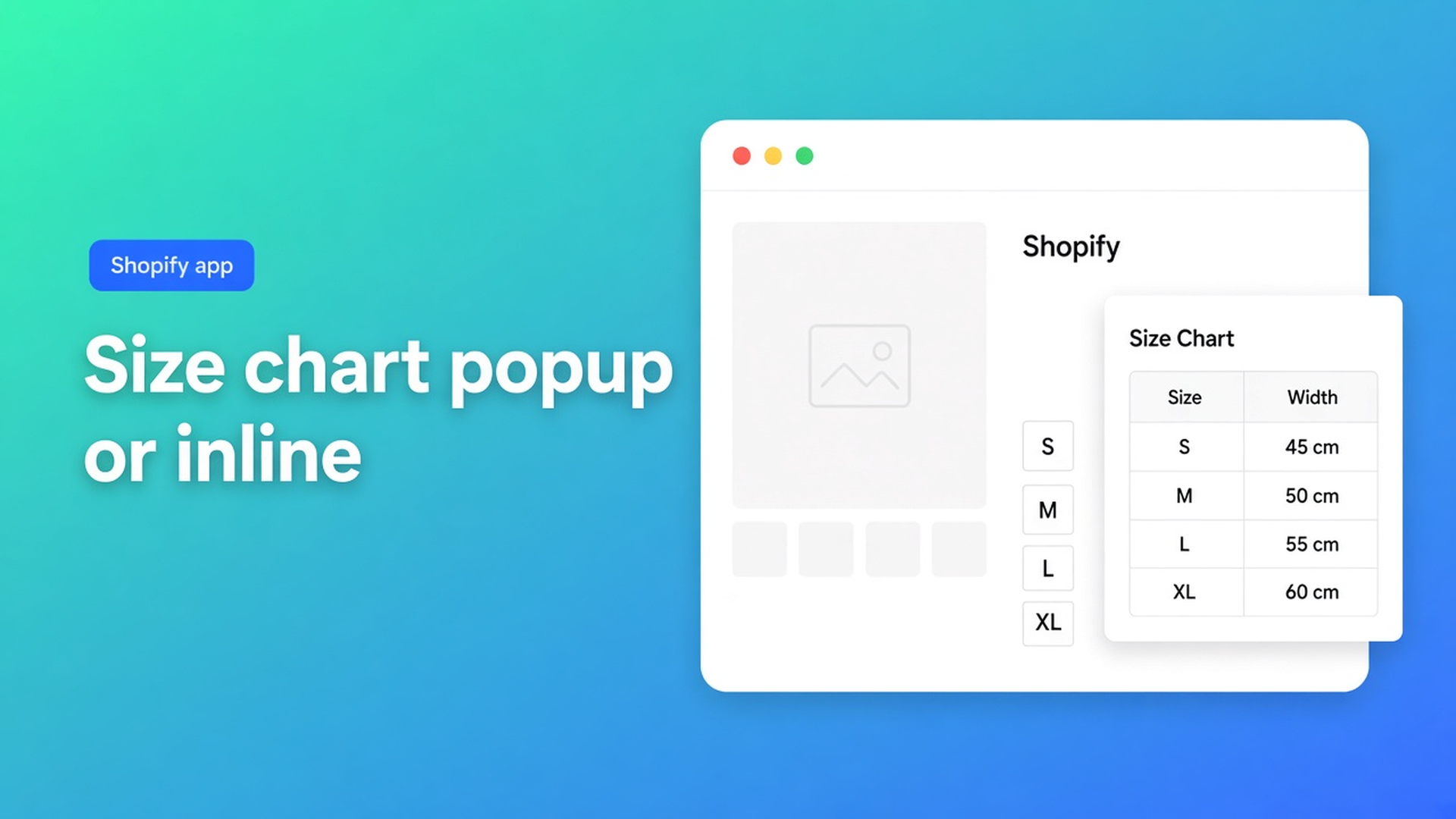
Shopify size chart popup vs inline: pick the shell next to Size
Desktop shoppers never tap “Size chart.” On a phone a twelve-column grid shoves Buy below the fold. Both miss the centimetres — the numbers were fine, the chrome was not. Shopify size chart popup vs inline is a Design choice: trigger plus overlay, or the grid in the template. One Size chart, two ways to sit beside the variant picker.
We already unpacked popup chrome and placement on the product page. Yesterday: shortcodes — not the default on a standard PDP. This piece is the conversion call next to Size: when the overlay wins, when inline does.
App Store name: OO - Advanced Table Builder. Docs may still say Tables, Specs & Comparisons. CTA: https://apps.shopify.com/tables-specs-comparisons.
Size is a variant. Fit is a table.
Adding variants: three options, 2048 variants. Size is XS–XL, not chest 92–96 cm. Shoppers who need centimetres want them *beside* the picker, before Add to cart. An HTML table under reviews is late. A PDF in the menu is later.
App blocks drop a block. You still choose whether that block is a button or the grid. Docs call it Display mode: popup versus plain (inline). Structure — rows, centimetres, optional measurement image — stays when you switch. You do not retype the chart.
On a phone the trade-off is sharper. Inline on a wide denim chart = scroll past Buy. A trigger that sits in theme-blue on mint, below the fold = an overlay nobody opens.
Defaults that keep the returns
Always inline “so it is on the page.” Fine on a four-row baby size run. On jeans with EU 32–44 and two fits as separate table blocks, the button drops. Bounce, or the “safe” variant.
Always popup because other shops do. If the trigger stays “Size guide” on a DE market, or sits next to a second app button, the overlay might as well not exist. Returns stay; the grid was already right.
Reuse the comparison modal as a size chart. Comparison tray/modal come from the app embed, plus Add to compare. Different type. Size-chart chrome is popup or plain on the Size chart type. Do not mix them.
Drop it in Specs “because it is a table.” Specs have no Add-to-cart auto-inject. Product specs block only. Wrong type.
None of those: one Size chart, flip Display mode, Size chart block (or auto-placement) next to the picker, translated trigger.
Same numbers, different chrome
OO - Advanced Table Builder is Free, 5.0 from 1 review. Listing: size charts, specs, compare, tabbed, Us vs Them; visual builder or AI draft; metafields; translations. Comparison tools mention Pop-ups; display options Floating chart. For Size charts the docs name Display mode.
Size charts: Display mode, trigger, colours. Design settings overview: chrome per type; Size charts = popup vs plain, trigger, table colors. Refine Design (copy, screenshot, or a URL for brand colours) leaves Structure alone.
Popup beside the picker when the grid is wide, or when Buy must stay high. Place the Size chart block near price and the selector. Visibility follows Settings; this block has no table-ID picker (that pattern is Tabbed and Us vs Them). Keep the trigger short. Translate it under Settings → translations per locale.
Plain / inline when tests show the overlay is ignored, or when a small table *is* the decision (few rows, one fit). The grid lives in the template. On a phone, check that Add to cart is still above the fold. If not, switch back to popup or slim Structure — not a second app.
Block vs auto-placement. Auto-placement: embed on, no Size chart block on the product template → matching enabled Size charts can render above Add to cart. That fallback is for the type, popup or plain. A block wins: you own the slot; Display mode owns the shell.
Enable the app embed: no embed, no auto-placement. Enable + visibility: a disabled table shows neither trigger nor grid.
`[oo-table id=…]` is for pages without a block, not a substitute for this choice on Default product.
Denim overlay, mattress inline
Jeans, EU 32–44, two table blocks (regular / slim). Display mode popup, trigger “Size chart.” Size chart block under the price, above Add to cart, next to Size. Private window, phone width: trigger visible before Buy; overlay shows both blocks. German market: translate the trigger, leave centimetres.
Mattress, three firmness variants, four-row size grid (70×200 to 180×200). Shoppers skip overlays; the centimetres *are* the choice. Display mode plain. Same block slot. On mobile, four rows still sit above the fold. No comparison tray.
Both: Enable, visibility on the right collection. Embed on. Never a Specs block as a size chart.
Get it live
Install OO - Advanced Table Builder (free).
Size chart in Structure (or AI draft, then check centimetres). Enable + product rules.
Design: Display mode popup or plain. Translate the trigger.
Theme editor: Size chart block by the picker, or embed on and auto-placement where the block is missing.
Desktop and phone: overlay opens, Add to cart stays reachable, grid matches.
Wrap-up
Shopify size chart popup vs inline is not a second table and not a shortcode trick. It is Display mode on the same Size chart, parked next to Size. Popup protects the buy button. Inline protects shoppers who never tap an overlay. Native Shopify stops at three options; centimetres belong in this table, not in another variant.
Set the mode in OO - Advanced Table Builder and measure on your own PDP which shell cuts returns.

Custom webshops, websites, and applications combined with smart online marketing to help your business grow online!


Reviews
5/5
Mail: info@onlineorigins.nl
Tel: 073 234 0612
KVK: 89825624
BTW: NL865123639B01
Bruistensingel 500,5232 AH 's-Hertogenbosch Cookies
© 2026 Online Origins