
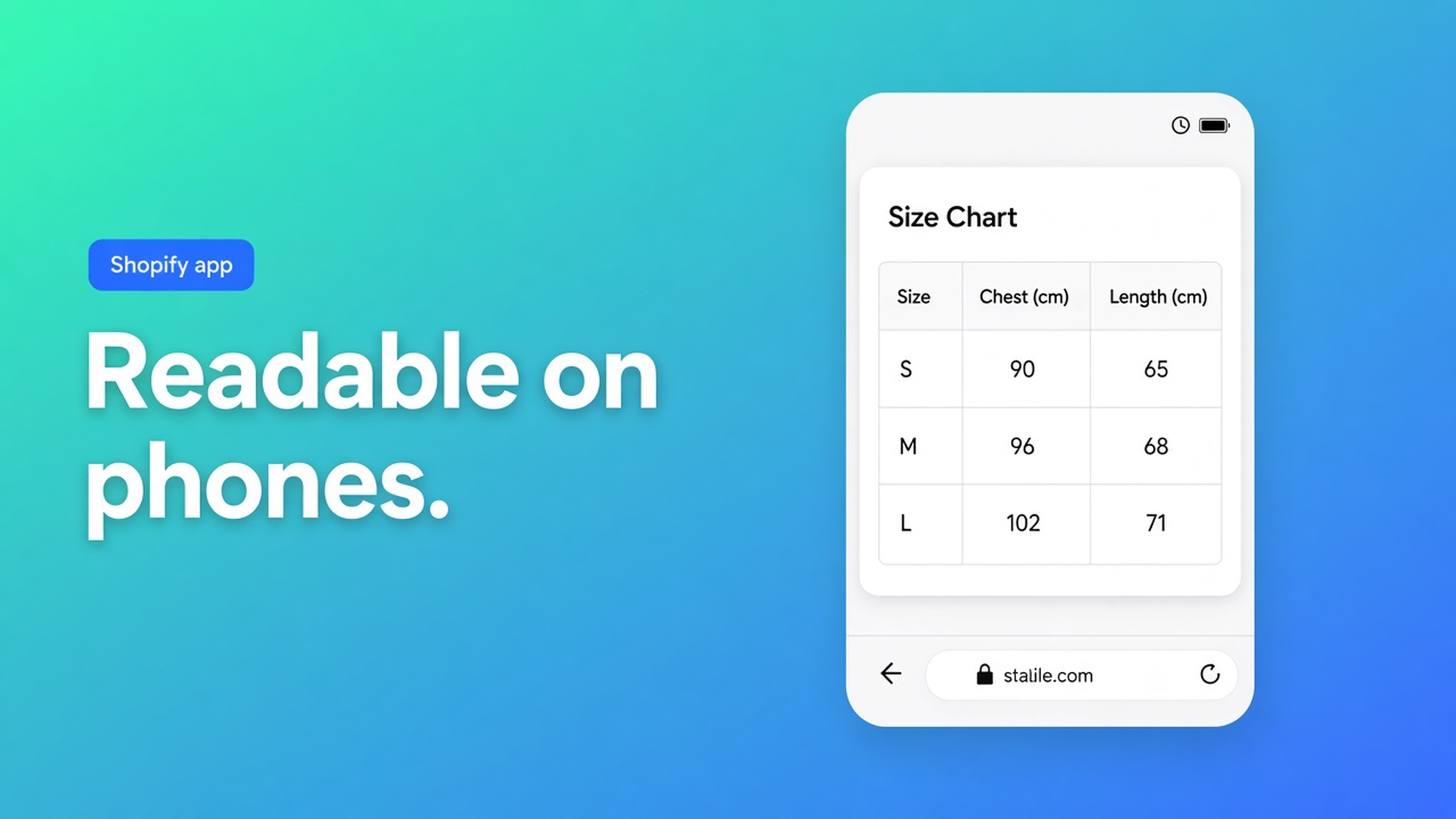
Shopify table mobile responsive: readable on a phone, not a squeezed grid
The shopper opens the size chart at 390 px. Twelve columns. Horizontal swipe until XS is gone. Shopify table mobile responsive is whether those centimetres stay readable — not whether a desktop grid “scales”. Checked 10 November 2026 on the OO - Advanced Table Builder listing (category *Mobile responsive*, app Free), docs Design settings overview and Size charts, and Shopify Help Extend your theme with apps. If Design grows a real mobile breakpoint, or the listing drops that category, re-read those three before you write “responsive means everything fits”.
The floating size chart post is about staying on screen while you scroll. This one is width: what a thumb can still read.
Native Shopify does not layout a size chart for a phone
Help Extend your theme with apps: embeds and app blocks land in the theme. Dawn will scale your gallery. An HTML table in a page or metafield either shrinks the type into noise or runs off the row. There is no Shopify switch labelled “size chart as popup on mobile”.
A PDF in Files, linked from the description: on iPhone that is a download, not a cell next to Add to cart. An Excel screenshot: sharp on desktop, mush at 2×.
What stores call “responsive” until the return lands
Twelve sizes as columns, inline under the gallery. Fine on a monitor. On a phone, column 1 (“XS”) is already off-canvas. The shopper picks M by vibe.
Specs as a classic table: eight rows of vendor / SKU / weight / fabric / lining / care / origin / EAN, in a block that eats the content width. At 390 px that is a wall.
Custom CSS with `font-size: 9px` “so it fits”. The listing lists Custom CSS as a display option. Design docs list templates, colours, fonts, spacing, chrome — not a canned mobile recipe. Nine-pixel type is not readability. See custom CSS and icons.
None of that is the listing category *Mobile responsive*. That category says the *app* can scale. Your structure (column count, display mode) decides whether a human can still read it.
What listing and Design actually give you — no invented breakpoint
On 10 November 2026 the listing is Free, 5.0 from 1 review. Categories include Size charts, Table layout, Color and font, Custom CSS, Floating chart, Mobile responsive. Hero: style colours, fonts, templates; place on products and pages.
Design docs: templates, colours, fonts, spacing, chrome (popup, tray, tabs). Per type:
Size charts — popup versus plain, trigger, table colours.
Product Specs — layout templates (details panel, classic, cards, …).
Comparison — grid/cards/spotlight, modal & tray.
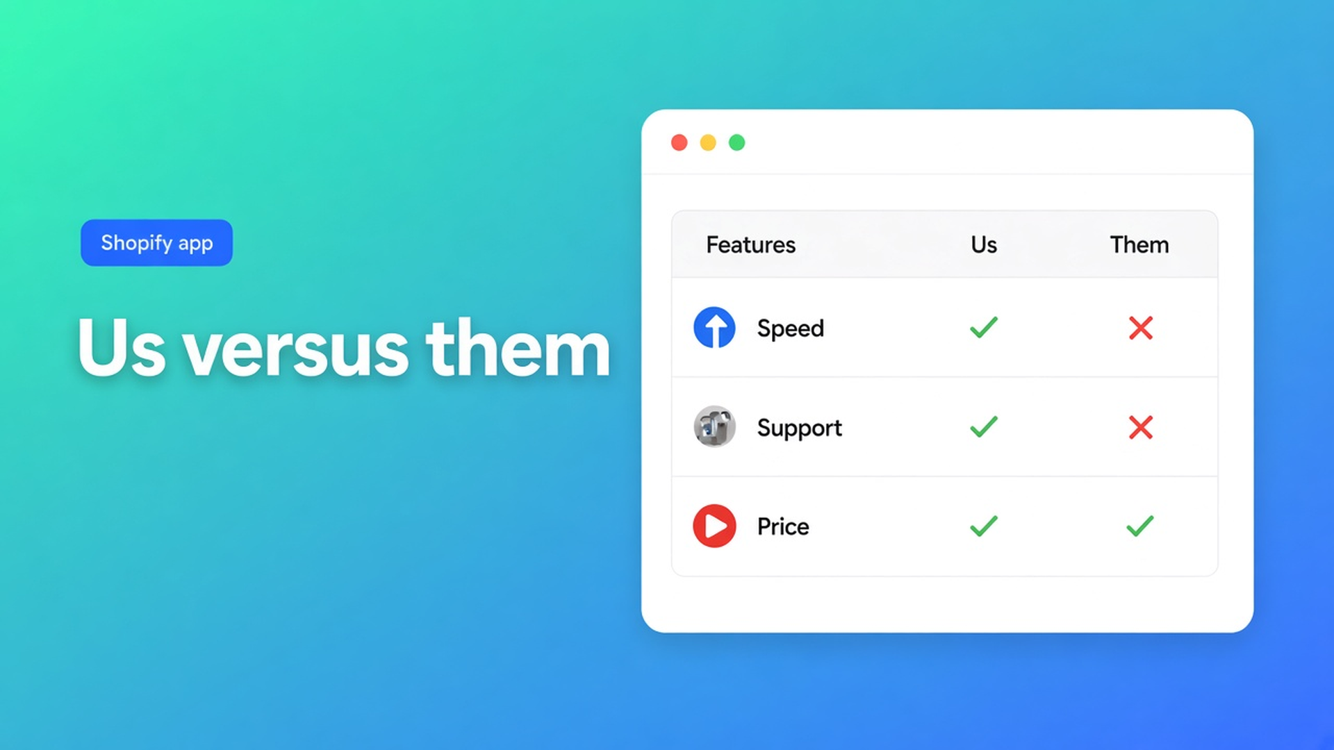
Tabbed / Us vs Them — tab style and column surfaces.
Size charts docs: display mode is popup trigger or plain content. No third “mobile-only” in that list. Men/women as separate table blocks, not one mega-grid. Edit cells in full screen.
App embed plus Size chart block, or auto-placement above Add to cart: theme app block, size chart on the product page. Specs have no ATC auto-inject — theme block only.
Type | What helps on a phone (docs 10 Nov 2026) | What not to claim |
|---|---|---|
Size chart | Popup instead of 12 columns inline; split men/women | A Design “mobile breakpoint” field |
Product Specs | Cards / details panel instead of a wide classic table | Specs that inject themselves next to ATC |
Comparison | Tray/modal instead of five products across the page | That compare is native Shopify |
All types | Fonts/colours in Design; test on the live theme on a phone | That Custom CSS is required for “responsive” |
Sources under the table: listing 10 Nov 2026 (Mobile responsive, Free); Design settings; Size charts. If Design adds a viewport toggle, re-check before you write “always popup on mobile” as an app fact.
Popup versus inline: size chart popup vs inline. Specs templates: product specs layout. Compare: comparison table layout. Brand polish: AI table design from a URL. The Advanced Table Builder listing stays the CTA; the app is Free.
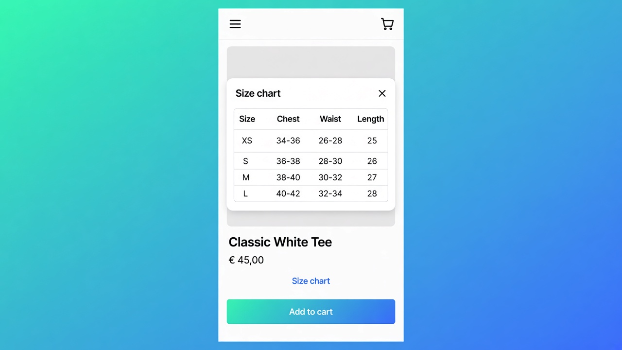
Worked case: sweater, XS–3XL, chest / waist / length
Knit brand. Three measurement rows, eight sizes. Native: a footer page named “Size chart”. On a phone that is two taps from Add to cart. Excel screenshot in the description: unreadable.
What I would ship on 10 Nov 2026. Size chart, popup. Trigger copy: “Size chart”. Eight sizes as the first row, three measurements as rows — not the inverse if that creates twelve columns. Do not merge men and women. App embed on, block on the product template, Enable in Settings. Then open the product URL on a phone, not only the theme editor’s desktop preview.
Same product, specs (fabric, weight, care): cards or details panel, not classic if you have eight rows. Theme block under the description. No auto-inject.
Collection compare: tray, not five columns in the page. Two products is enough at 390 px; the third belongs in the tray.
Test: Chrome’s device toolbar lies about tap targets. One real iPhone shot of popup open, specs cards, compare tray. If the trigger covers Add to cart, the block order is the bug — not “the app is not responsive”.
The listing stays Free. No plan-gate for mobile.
Get it on a phone before you call it done
Pick chrome that is an overlay on a narrow screen (popup, tray, cards), not a wider table. Split charts. Enable + embed + block. Open the URL on your phone. Only then reach for Custom CSS if the listing option is truly needed — not to force 9 px type.
Bottom line
For the knit sweater I would put the size chart on popup, specs on cards, and publish only after a real-phone check where XS is still on screen. Shopify table mobile responsive is a listing category, not a magic viewport in Design. Native Shopify scales HTML until it is unreadable. Docs give popup versus plain, templates and tray. Listing 10 Nov 2026: Free, Mobile responsive as a category. Without a phone test, “responsive” is a checkbox. If Design changes, this advice expires.
Ship the table from the OO - Advanced Table Builder listing and open Design plus Size charts in the docs before you leave twelve columns inline on the product page.
This blog is presented to you by

Floris-jan de Vries
Co-owner / Back-end developer / Shopify Expert
As a full-stack developer, Floris-Jan ensures the technical logic behind the design. He also uses his extensive knowledge of Shopify every day to provide our clients with the best possible support.


The Shopify Select partner for ambitious e-commerce businesses that want to grow!

Services
Reviews
5/5
Mail: info@onlineorigins.nl
Tel: 073 234 0612
KVK: 89825624
BTW: NL865123639B01
Bruistensingel 500,5232 AH 's-Hertogenbosch Cookies
© 2026 Online Origins