
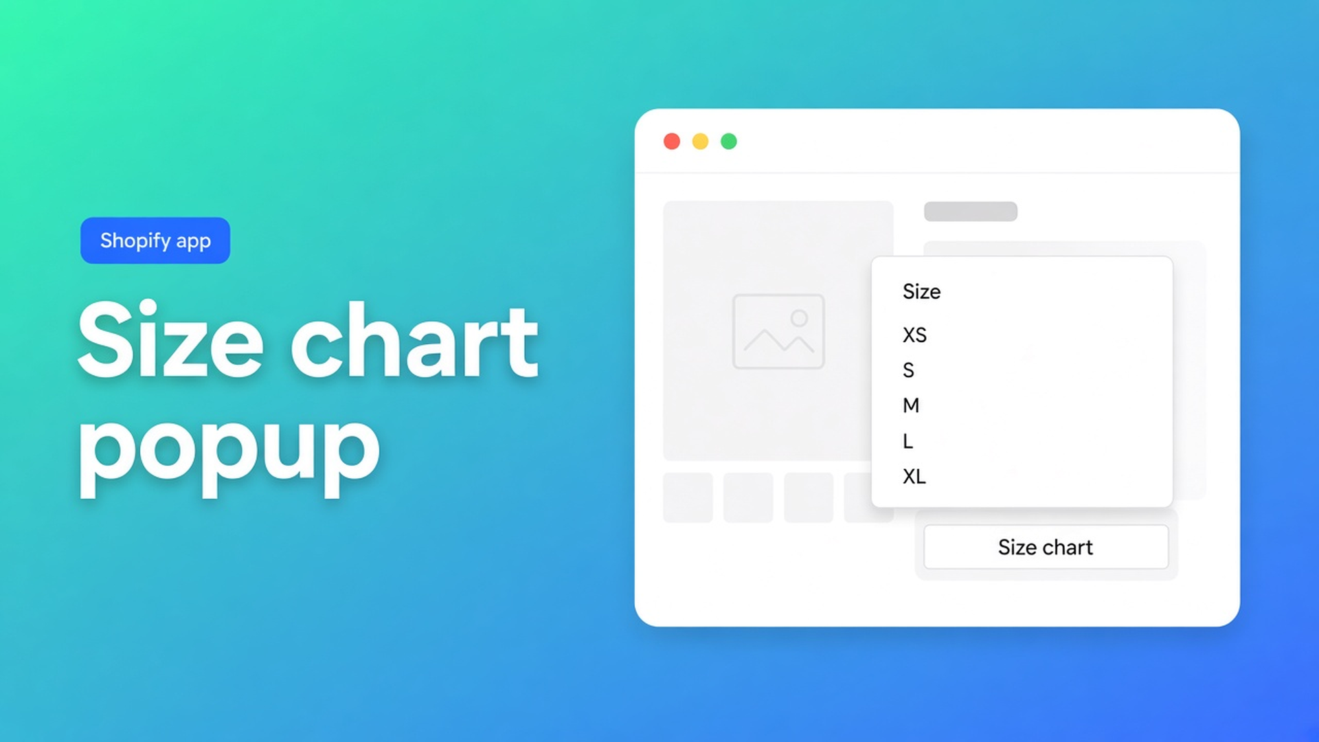
Shopify size chart popup: when to use the overlay vs the table in the page
The measurement table is done. The centimetres are right. Nobody clicks. Or the opposite: the full grid pushes Add to cart below the fold on a phone. That is not a Structure bug. That is chrome. A Shopify size chart popup is Display mode on the same Size chart: a trigger on the product page, the table in an overlay. Plain puts that table in the template. Pick the wrong mode and shoppers never measure — or they scroll past the button.
This article is popup versus plain. We already covered what a size chart app is and where it sits on the product page. Here the subject is Design: trigger label, overlay, when to switch to plain.
App Store name: OO - Advanced Table Builder. Docs still say Tables, Specs & Comparisons in places. CTA: https://apps.shopify.com/tables-specs-comparisons.
The problem: the variant picker beats the description
Adding variants: max three options, 2048 variants. Size is S/M/L, not chest 92–96 cm. Shoppers who need centimetres want a table *beside* that picker. A PDF in the menu or an HTML table under reviews is too late. App blocks can sit next to the button; you still choose whether that “something” is a trigger + overlay or the grid itself.
On a phone the choice is sharper. A twelve-column grid inline shoves Buy buttons down. A trigger nobody sees never opens. Display mode is that trade-off — not a second app.
What merchants try instead
1. Always inline “so everyone sees it”
Fine on desktop. On mobile, Add to cart disappears. Bounce.
2. Always popup “because it looks tidy”
If the trigger “Size guide” sits in theme-blue on mint, or below the fold, nobody opens it. Returns stay.
3. Reuse the comparison modal as a size chart
Comparison has a tray and modal via the app embed, plus its own Add to compare. Different type. Size-chart chrome is popup vs plain in Design on the Size chart type. Do not mix them.
None of those paths: one Size chart, Structure fixed, Display mode flipped without retyping centimetres.
How Advanced Table Builder sets the chrome
OO - Advanced Table Builder is Free, 5.0 from 1 review, launched 17 September 2026. Listing: size charts, specs, compare, tabbed, Us vs Them; visual builder or AI draft; metafields; translations; placement on products and pages. Comparison tools include Pop-ups; display options include Floating chart, custom text, mobile responsive. Those are listing labels; for Size charts the docs specify Display mode.
Display mode — popup trigger or plain content.
Trigger label, colors, fonts, table-surface styling.
Design settings overview: chrome (popup, tray, tabs) per type. Size charts: popup vs plain, trigger, table colors. Same table, different shell. Structure (text / table / image blocks, Men+Women as separate table blocks) stays when you switch modes.
When popup
The grid is wide (many sizes, two fittings in separate blocks).
You want buy buttons high on mobile.
Shoppers treat “Size chart” as a control next to Size.
Place the Size chart block near price / buy buttons. Visibility follows Settings, not a table ID in the Size chart block (the ID picker is for Tabbed and Us vs Them). Keep the trigger short. Translate it in Settings → translations if Markets has more languages — customer-facing strings, not the admin description.
When plain
The table is small (one fitting, a few rows).
Tests show the trigger is skipped.
The chart *is* the decision info (one measurement set for custom furniture).
Plain inlines the grid. Auto-placement (docs) can put enabled Size charts above Add to cart when the embed is on and there is no Size chart block. That fallback is for the type, not extra for popup. With a block, the block wins — popup trigger or plain grid, depending on Design.
What popup is not
Not a Specs overlay. Specs: Product specs block only, no ATC auto-inject.
Not the comparison tray. Tray/modal belong to Comparison + embed.
Not a second Structure. No extra table ID required on the Size chart block.
Enable the app embed: without it, no auto-placement and no shortcodes. A theme block alone is enough if you place it yourself. Enable + visibility: a disabled table shows no trigger.
Optional: Refine Design with a description, screenshot, or website URL for brand colors/fonts; Structure stays intact after you confirm.
Example: hoodie popup, socks plain
Hoodie: Size XS–XL, two table blocks Men/Women, image block with a measurement diagram. Display mode popup, trigger “Size chart”. Size chart block above Add to cart on Default product. Private window, phone width: trigger visible *before* the button; overlay shows both blocks.
Socks: five EU-size rows. Popup is overkill. Same app, second Size chart, Display mode plain, visibility Selected products → socks. No twelve-column overlay for five cells.
Do not one Display mode for the whole catalog. Per chart.
What you need to start
Install OO - Advanced Table Builder (Free).
Quick start: Size chart → Structure → Design (popup or plain) → Enable + visibility → embed + block or auto-placement.
Test the trigger on mobile. No click? Change the label or placement, or switch to plain.
Keep Men/Women as separate blocks — multiple size charts.
Do not claim Specs auto-inject. Do not pitch another OO app.
Wrap-up
A Shopify size chart popup is chrome, not a second product. Popup keeps the PDP short; plain shows centimetres without an extra click. Structure and placement stay the same. Native Shopify stops at the Size option. Set the mode in Design, test the trigger next to Add to cart, and switch if shoppers ignore it.
Install Advanced Table Builder and pick Display mode before the next “wrong size” return lands.

Custom webshops, websites, and applications combined with smart online marketing to help your business grow online!


Reviews
5/5
Mail: info@onlineorigins.nl
Tel: 073 234 0612
KVK: 89825624
BTW: NL865123639B01
Bruistensingel 500,5232 AH 's-Hertogenbosch Cookies
© 2026 Online Origins