
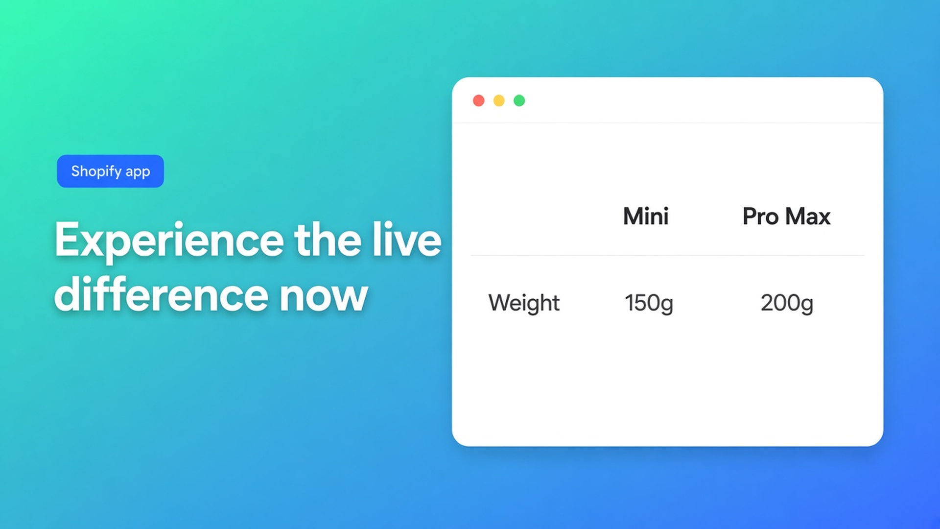
Shopify highlight differences in a comparison table
Mini 1.2 kg, Pro 1.8 kg, Max 2.4 kg. In the modal they look like three equal rows. The shopper hunts with their eyes. Shopify highlight differences in comparison table is not a third SKU and not a screenshot on a page. It is how the OO - Advanced Table Builder listing groups comparison tools — highlight differences, filter and sort, show and hide — and how the docs fill that with live attribute rows. Checked 11 November 2026 on the listing (Free, 5.0 from 1 review) and docs Comparison table, Design settings overview, Comparison placement and Us vs Them. If the listing drops that category, or Comparison docs gain an explicit “diff” toggle, re-read those before you promise the app will paint the gap by itself.
3 November covered the Us vs Them highlight column. That is you vs “the rest”, cells you type. This one is the live comparer: shoppers pick SKUs, values come from Shopify.
Shopify has no runtime comparer
Collection cards, search, a weight metafield on the product page. No tray that keeps Mini + Pro until a modal opens. No rows that refill per selected product. Product Help does not add that runtime. A page with an Excel screenshot goes stale the day the price list moves.
What shops build until then:
A table in the description. Mini’s price in prose. Pro changes; the prose does not.
Three specs blocks stacked. No side-by-side.
Us vs Them for two SKUs. That type is brand vs competitor, not a picker.
None of those is: you define attribute rows; the storefront fills cells from each selected product.
What “highlight differences” on the listing actually is
Live listing (11 Nov 2026): Free. UI in English. Comparison-tool categories: comparison table, multi-product, variants, specifications, filter and sort, highlight differences, show and hide. Works with AI, Excel, Google Sheets. No paid tier.
Comparison table docs: you add attribute modules (Weight, Price, options, custom attributes). Groups allowed. Placeholder labels “Product 1 / Product 2” are admin preview only. The docs are blunt: *Do not hard-code per-product cell values for live comparison rows. The storefront fills cells from each selected product.*
That is the highlight I will claim on 11 Nov 2026: the gap shows because the value is live, not because you painted Mini green in a cell. A true “diff” control (colour only the unequal rows) is not in the Comparison docs. Do not invent it. Filter and sort and show and hide are listing categories; Comparison docs talk Structure modules, Design (grid / cards / spotlight), and placement.
Us vs Them does have a highlight column, yes/no/text, optional CTAs. Different table type, different theme block. Do not swap them.
Job | Type | Where the gap comes from | Source 11 Nov 2026 |
|---|---|---|---|
Shopper picks Mini vs Pro | Comparison | Live Shopify fields / metafields | Comparison table docs |
Brand vs “other brands” | Us vs Them | You type yes/no/text; highlight column | Us vs Them docs |
Hide rows that match | listing: show and hide | no extra Comparison doc step found | listing category; do not invent a path |
Sort inside the modal | listing: filter and sort | same: listing, no extra Comparison click path | listing 11 Nov 2026 |
How the modal looks | Design | grid / cards / spotlight | Design overview |
Sources under the table: listing 11 Nov 2026; Comparison table; Us vs Them; Design settings. If Comparison docs add a highlight toggle, the third row can become a click path. Until then: live modules, no hardcoded Mini cell.
Placement: app embed required for tray/modal. Compare button theme block, or auto-inject under the price. Specs have no inject next to Add to cart. See comparison table on the product page and tray/modal. Grid vs spotlight: layout — look, not which SKUs sit in the tray.
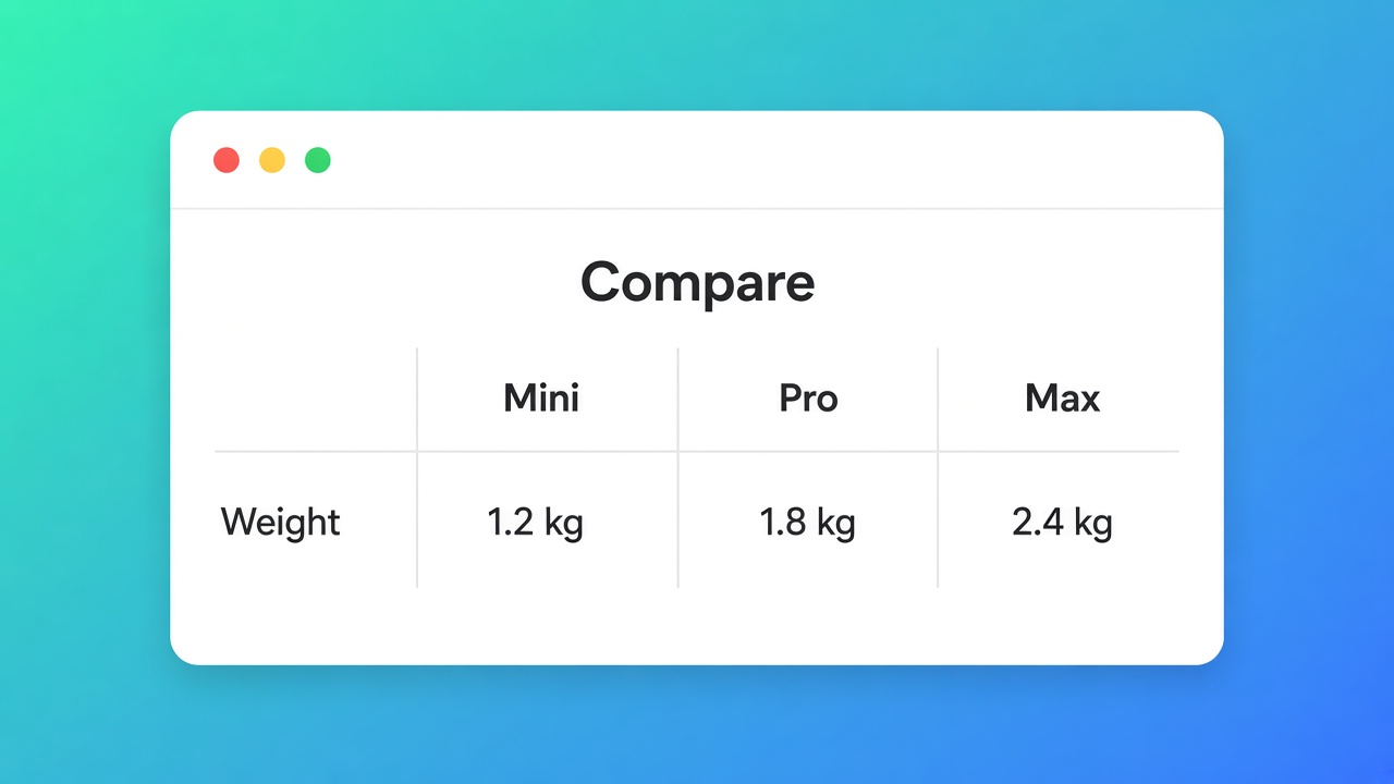
Three speakers, weight and wattage as Shopify modules
Shop “North Audio”. Mini / Pro / Max. Weight and wattage already live on the variant. What I would do on 11 Nov 2026:
Create table → Comparison (or an AI draft, then review modules).
Structure: Shopify modules Weight and Price, plus a metafield for wattage — not a custom attribute “1.2 kg” typed into a cell. FAQ: Comparison fills from product/variant data.
Design: spotlight if Max should win the glance, grid if three columns should feel equal. Templates colour chrome; they do not fill weight.
Settings: table enabled, visibility the speaker collection. Embed on. Compare button on product and, if you want, on collection cards (placement docs: show on product cards).
Storefront: Mini + Pro in the tray, open the modal. Weight differs. A hardcoded “light / heavy” custom row lies the day Mini gets a new variant.
AI may draft. Review module types: Weight/Price/Color as Shopify modules, not custom. Same caution as AI from a description. Mobile: popup/cards/tray first, then a real phone — responsive. No button, no modal: compare button missing.
Us vs Them stays for “why us, not the brand beside us”. That is where you highlight a column. Here the data highlights itself once you stop filling cells.
Get it live
Pick Comparison, not Us vs Them, when shoppers choose SKUs. Bind live modules. Embed plus button or auto-inject. Preview two real products, not the admin placeholders. The OO - Advanced Table Builder listing stays Free; do not sell a paid “highlight pack”.
Close
On 11 November 2026 I would not put Mini vs Pro in a description table, and I would not force it into Us vs Them. I would ship one Comparison table with Weight/Price/wattage as Shopify modules, embed on, and open the modal on two real SKUs until the kilogram gap is obvious. I will not claim a “colour only unequal rows” control — it is not in the Comparison docs. If the listing or those docs change, this note is stale. Until then the difference is the live cell, not the paint.
Install: OO - Advanced Table Builder.
This blog is presented to you by

Floris-jan de Vries
Co-owner / Back-end developer / Shopify Expert
As a full-stack developer, Floris-Jan ensures the technical logic behind the design. He also uses his extensive knowledge of Shopify every day to provide our clients with the best possible support.


The Shopify Select partner for ambitious e-commerce businesses that want to grow!

Services
Reviews
5/5
Mail: info@onlineorigins.nl
Tel: 073 234 0612
KVK: 89825624
BTW: NL865123639B01
Bruistensingel 500,5232 AH 's-Hertogenbosch Cookies
© 2026 Online Origins