
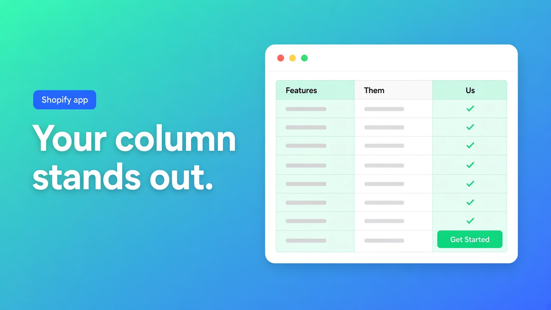
Shopify us vs them highlight column
The rows are done. Your column sits next to “typical foam”. On a phone both stripes look the same grey. The CTA under your column is the one you want, and it disappears. A Shopify us vs them highlight column is that mark — not a second table, not named rivals, not Comparison with live SKUs.
OO - Advanced Table Builder builds Us vs Them with 2–4 columns, yes / no / text rows, optional CTAs. Mark your brand column as highlighted. Design templates include Tint, Pillar, Soft, Gradient; colours, surfaces, type and CTA for that column. Drop the theme block and pick the table by ID. Enable has to be on.
Related: the Us vs Them table type. That article is the layout. This one is only the highlight — why an unmarked grid reads like a spreadsheet.
Equal columns do not sell a USP
Native product pages have title, price, variant picker, rich text. They do not have “us / the rest” columns. Until highlight exists, shops paste:
an HTML table in the description, every column the same weight;
a slide screenshot with the brand in the middle because the file was built that way;
Comparison, where the shopper picks two SKUs. That is not a fixed “us” column.
Docs: columns *can* stand for you vs competitors. Do not name other brands. Use generic heads: “Our hybrid”, “Typical memory foam”, “Budget foam”. The highlight points at your column, not at someone else’s listing.
Enable, visibility, and products: Tabbed and Us vs Them are chosen in the theme block by table. Enable still has to be on. Off + block = blank. Size charts and comparison have product visibility. Us vs Them does not use “all products”. The block is the placement.
What you tick in Structure
Listing (3 Nov 2026): Free, 5.0 from 1 review. Size charts, specs, compare, tabbed, us vs them. Visual builder, AI draft from a description or screenshot, translations, placement on products and pages. No paid plan on the listing.
Set 2–4 columns: labels, highlight, CTA.
Feature rows: yes / no / text per cell.
Mark your brand column highlighted when it should stand out.
Highlighted is a column setting, not another table type. Unticked, every column matches. Ticked, Design applies highlight colours, surfaces, type and CTA to that column.
CTA per column: yours says “See the mattress”, the others stay empty or a quiet text link. Optional CTAs are allowed. Do not put “buy from us” under a fictional alternative.
Rows are yes/no/text. “100-night trial” is text in your column, no or a dash elsewhere. There is no live metafield picker like Comparison — cells are fixed. That is the point.
AI can draft from a description. Then Structure: column 1 highlighted, heads without rival names, CTA only under you. AI will not guess the highlight if you never mark the column.
Design: make the mark visible
Design settings: Us vs Them has highlight templates and column surfaces. Docs list Tint, Pillar, Soft, Gradient, and more.
Pick one template. Push brand colour through the highlighted column, not the whole grid, or contrast dies. Highlight type can be heavier. That column’s CTA can follow the theme button.
Do not stack three templates. One table, one highlight. Soft when you want calm, Pillar when the column should feel like a card, Gradient when the brand colour already is a fade. Check a phone: two columns, highlight still readable, CTA still tappable.
Refine with AI on Design exists (listing: colours, fonts, templates). A brand URL on Design is allowed. Review: the highlight must be *your* column, not column 2 because the model liked the middle.
Walkthrough: three columns, one highlight
“Night & Feather” sells one hybrid. Columns: Our hybrid (highlighted), Memory foam, Budget foam. Rows: core, trial, delivery, flip, warranty. CTA only on column 1.
Install OO - Advanced Table Builder. Free.
New Us vs Them table. Three columns. Column 1 highlighted. No rival brand names.
Yes/no/text rows. CTA on column 1.
Design: Pillar or Tint. Highlight colour = brand. Other columns quiet.
Settings: Enable on. Internal description can say “PDP hybrid”; shoppers never see it.
Theme editor, product template: Us vs Them block, pick this table by ID.
Product page: column 1 stands off. Without Enable or without the ID the block stays empty.
Shortcode `[oo-table id=…]` works on a page. Same rule: Enable on. Size-chart or compare auto-placement does not apply; Us vs Them is block or shortcode.
Docs do not describe two highlights on one table. Mark one column. Four columns are allowed; they get tight on a phone. Test 2 and 3 first. Putting the highlighted column first (your brand on the left) shows it earlier on a small screen than parking it on the right.
The listing lists “Highlight differences” under comparison tools. That is the Us vs Them job: make the gap visible. It is not a live diff between two SKUs in a collection. That live comparer is Comparison, with tray or modal, and a different block.
Ship it
Build 2–4 columns, mark yours, pick Tint or Pillar, Enable on, table ID in the block. No competitor names. No second SKU picker — that is Comparison.
One review, 5.0. Do not invent more stars.
Wrap-up
A Shopify us vs them highlight column is Structure → highlighted on your column, then Design (Tint, Pillar, Soft, Gradient) so that column carries the CTA. Enable on. Table ID in the Us vs Them block.
Set the mark in OO - Advanced Table Builder before the grid turns into a grey spreadsheet on a phone.

The Shopify Select partner for ambitious e-commerce businesses that want to grow!


Services
Reviews
5/5
Mail: info@onlineorigins.nl
Tel: 073 234 0612
KVK: 89825624
BTW: NL865123639B01
Bruistensingel 500,5232 AH 's-Hertogenbosch Cookies
© 2026 Online Origins